
By having a responsive web design you are allowing your website to be easily viewed on multiple devices. There are other ways to make your website accessible from tablets and smartphones, but responsive web design is the best. Google found that 81% of mobile searches are driven by speed and convenience. If your website is made for several devices, your website will now rank higher.
Google believes that mobile use is only going to increase in the future, that more people will start using their smartphones for almost every search they do. If your website is not optimized for mobile, you are significantly impairing your SEO. Consumers are doing a majority of their searches from these devices and if you’re ranking lower than you should be, the consumer might never make it to the page your website is on, simply because consumers don’t go past the first page of search results.
1. Recommended By Google
With 67 percent search market share, when Google speaks, search marketers listen. Google states that responsive web design is its recommended mobile configuration, and even goes so far as to refer to responsive web design as the industry best practice.
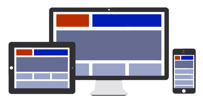
2. One Website, Many Devices
One of the most appealing aspects of responsive web design is that a responsive website can provide a great user-experience across many devices and screen sizes. This is an important characteristic, since it is impossible to anticipate all the devices and screen sizes searchers will use to access your site. A site that works well regardless of these variables will provide a better and more consistent user-experience than a separate mobile site that is designed for a specific device and screen size.
3. Easier to Manage
Having a separate desktop and mobile site requires having separate SEO campaigns. Managing one site and one SEO campaign is far easier than managing two sites and two SEO campaigns. This is a key advantage a responsive website has over a separate mobile site.